01
Signals from the client deep dive
In a 3-hour deep dive, the client named the sites they liked: niwacan.jp, maupets.com, lqve.jp.
All three are the same Japanese-aesthetic family — minimal + serif headline + pure white background. Plus "clean + Japanese" was a non-negotiable — the aesthetic direction was locked in the first round of the deep dive.
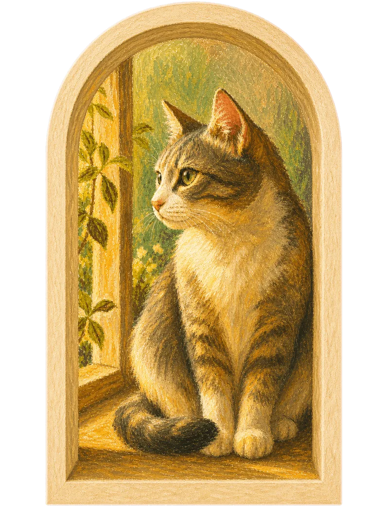
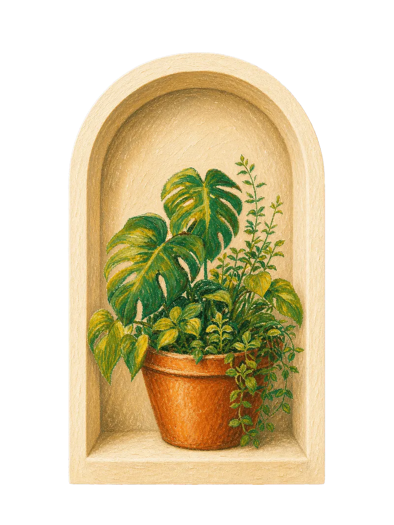
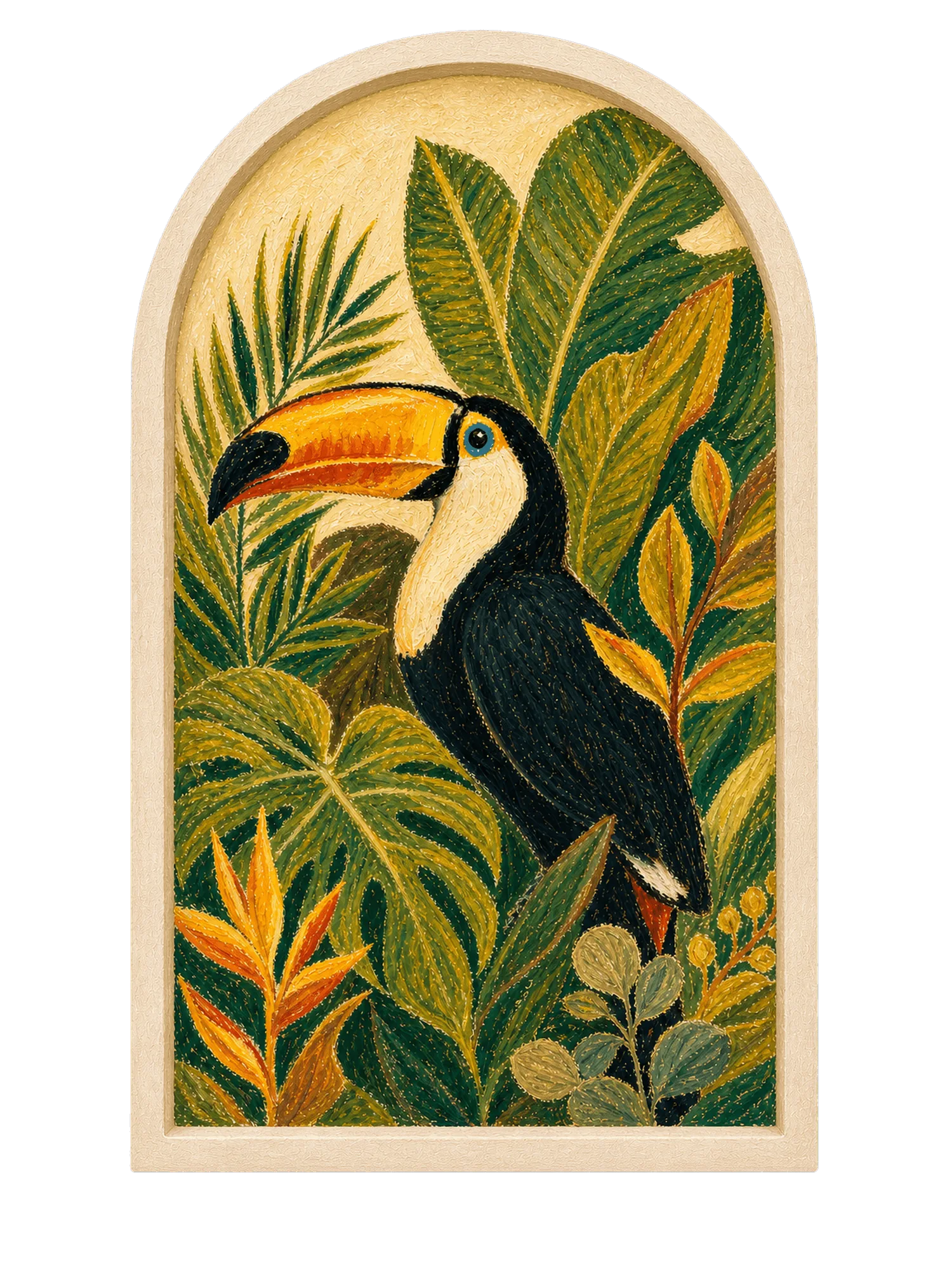
So we skipped ui-ux-curator's 3-tier recommendation, locked in the single niwacan-illust template, and put budget and time into two things: color and hand-drawing.